 Jonathan Laskovsky is the Senior Coordinator, Research Partnerships in the College of Design and Social Context at RMIT University.
He is primarily responsible for managing research partnerships support and administration within the College.
Alongside this role, Jonathan has research interests in modern and postmodern literature with a particular focus on fictional space and critical theory.
He tweets as @JLaskovsky and can be found on Linkedin. His ORCID is 0000-0002-4692-0334.
Data is increasingly part of our lives. This isn’t surprising when you consider that networking giant Cisco has predicted that the data centre traffic alone in 2018 will hit 8.6 Zetabytes. That’s 8.6 trillion gigabytes, or enough to cover 119 trillion hours of streaming music. Enough for 22 months for every single person on the planet in 2018!
We are increasingly exposed to data in research as well. Think about digital humanities, for example. This means that we increasingly need better ways to display, interpret, and analyse it.

What we are really talking about here is Data Visualisation (DataViz).
In a world of big data, the importance of good DataViz cannot be underestimated.
This applies along the entire spectrum of research, from grant applications to reports to journal articles.
Or at least it should.
In my job, I often see project descriptions of concise, tightly written prose. Succinct, well-structured arguments that outline in crisp sentences what the research is about, and clearly identify roles and responsibilities in measured, orderly terms.
Then there is often a table.
Usually, this table is outlining either data discussed within the proposal, or showing the project timeline with milestones, and staff markers and outputs, etc.
This table is almost always hideous.
Let me be clear: often, this is not always entirely the fault of the author. Microsoft Word deserves a special place in hell for its table tool. A special burning place with sharp pointy things. It deserves this because, for a product that has been around for over 30 years across three platforms, it still doesn’t include a decent table tool. That’s right, everyone – there was an Atari version of Microsoft Word (for those of use who can remember when Atari made computers…).
Really, though, Word is not what you want to fall in love with.
When it comes to data, you should only have eyes for Excel, which is Word’s smarter, slightly nerdy sibling.
Excel is your friend. This is because, unlike Word, Excel treats your data with respect. Excel would totally call you the next day. More importantly, it’s a program designed specifically to handle and process data (yes, there are other programs such as R and Python, but let’s walk before we run).
This means you can create incredibly powerful formulas with it. These range from complex, nested ‘if’-statements, to simply having columns that automatically add up your budget items so your total is actually the sum of the numbers in them. Trust me when I tell you that this doesn’t always happen, especially when you create your budget in Word.
Yet, using Excel is only half the picture. Don’t just take my word for it – listen to the expert.
Stephanie Evergreen introduced me to the wonderful world of DataViz. I attended a presentation she gave that completely changed my approach to Excel, as well as my approach to presenting data in general.
Listening to Stephanie talk for just one hour had me convinced of not only the importance of DataViz, but also its relevance and importance in the world of research.
Three of Stephanie’s points really stuck with me:
1. Humans absorb information visually.
2. Poor DataViz obscures your argument, so
3. Using DataViz well increases the effectiveness of your argument.
These are really important points and apply to the entire gamut of research outputs from theses, to conference presentations, to papers and books. Let’s look at them in a little more detail:
1. Humans read visually (or charts vs tables)
First, columns that add up are a great start (believe me), but a cramped table full of figures is hard to read, hard to connect to your argument, and can potentially frustrate the reader.
Remember, whether you’re submitting a journal article or grant proposal, frustrating the reader is the last thing you want to do.
This means we need to ask whether a table is really the most effective way to present the data. The answer is probably not. By all means, include the figures in an appendix, but a chart is often a better option because humans process visual information more easily than they do numerical (.pdf – Evergreen’s PhD thesis).
2. Poor DataViz can obscure (choose wisely)
“Aha! So, I just put everything into a chart right?”
Well, not really.
A chart is often helpful but it’s not a silver bullet. I love Excel but its defaults are generally agreed to be awful from a DataViz perspective.
From dull or bizarre colour schemes to overly complicated 3D charts, Excel can present the user with too many options. Most of them will over-complicate what you are trying to present, and detract from your point.
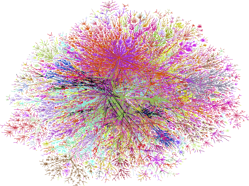
Data art is a perfect example of this – it looks pretty, but do you really have any idea what message this chart is trying to convey?

Exactly. (It is a map of the internet made in the 1990s, printed in Wired magazine).
It can happen in the everyday as well, though. Look at the chart at the top of this post. Something very exciting is happening with the yellow column, but this chart renders it almost impossible to tell anything about the rest.
The scale is thrown off completely by that immense column and it makes the rest of the chart effectively meaningless. And this brings me to Stephanie’s third point.
3. Good DataViz strengthens your point.
The principles used to create good DataViz apply to all forms. A well-crafted table can show clearly how milestones and tasks relate to each other. A thoughtfully constructed Gantt chart can communicate how activity and outputs will map out across time (what is a Gantt chart, you ask?).
A carefully built chart can emphatically drive your point home.
——————————–
So, how do we learn good DataViz habits?
Well, a few tips I’ve gleaned from Stephanie are: keep it simple and use colour to only highlight the point you want the chart to make. Get rid of anything 3D and, remember, pie charts are among the hardest for humans to process. Stephanie’s blog outlines all of these points (and many more) in full detail and is well worth a visit.
Like it or not, data is here to stay. Avoid it at your peril. It may not define your field, but you cannot avoid interacting with it. Learning how to use it well will only enhance the impact of your research.
Best of all, thanks to people like Evergreen, learning how to use it well is now easier than ever.
Take a little time to engage with it, and I guarantee you that you too, will only have eyes for Excel.

Jonathan – Thanks for your interesting post. I’ve always loved Excel, but when it comes to data visualizations I’ve found it relatively clunky and unnecessarily difficult to use. Earlier this year I tried out some dedicated data visualization tools for the first time and have fallen in love with Tableau. I was also impressed with Spotfire. Have you ever tried either of these tools or anything similar? If so, I’d be interested to read what you think of them, especially compared to Excel.
LikeLike
Thanks Clayton – I’m glad you enjoyed the post. I’ve not yet used dedicated dataviz tools though that’s clearly the next step for me and I’ll definitely check out Tableau (I’ve only heard good things about it). I agree that Excel can sometimes be clunky and the default settings and colours are pretty dire. Having said that though, I’ve used Stephanie’s tips on design and clean presentation a lot. I’ve found that really helps to get away from the stock Excel problems.
I have to admit that I’m perhaps blinded by Excel power in the formula area. Time to move on to Tableau?
LikeLike
Thanks Jonathan. Tableau also uses formulas – powerful and similar to Excel from what I can see – but because I’m more familiar with Excel I’ve tended to use Excel for that purpose before importing into Tableau. The two products complement each other rather than anything else. Tableau accepts excel files as imports (as well as other formats) but I find the visualizations much easier to create and manipulate, even for a novice such as myself. Geographical coordinates are automatically plotted onto a map, for example, and you can just click and drag whatever measure you’re interested in onto the chart. Colours are easy to edit and you can choose from a good selection of colour schemes and easily edit labels and lines to give you the look and feel you’re trying to create. Other data visualization tools can do similar things too, I’ve found. Definitely worth looking into…
LikeLike
[…] of things with data. For example, you can prepare data, code data, analyse data, synthesise data, visualise data, present data – and, if you’re like me, you can love data. In fact, I adore data! A new […]
LikeLike
While I agree with you that visualising data appropriately, I am a bit of an enemy of excel. I come from a (relatively) data heavy background so use the R language to do all my analyses and figures. Though the learning curve is a bit steep I would encourage you and your readers to look up ggplot2, an R package that is (for me) the best of the best when it comes to data visualisation. And best of all it’s all free under a creative commons license!
LikeLike
And whatever tool you are using to visualise, /always/ get someone who is colourblind to check that your visualisation will work for them (preferably more than one person for more than one type of colour blindness). Given the proportion of the population – males especially – who have some inability with seeing colours, you otherwise risk having a key decision-maker not recognise the point you are trying to make. Very often, my favourite such checker says: ‘That looks like a few shades of brown to me’ when I show him some graphic that has been automatically generated in Excel.
LikeLike
Good point, Miriam.
The basic rule is – don’t rely on colour alone to convey information. That is why a lot of people use different patterns as well as different colours.
There is a free tool called Colour Oracle that is a colour blindness simulator.
http://colororacle.org/
It doesn’t replace testing with real people, but it should be able to help if you don’t know anyone with colour vision deficiency.
The other problem that arises in this area is colour contrast. If you want to be sure, a 7:1 colour contrast will work for everybody. If that doesn’t give you enough range, then contrast ratio of 4.5:1 is pretty much the lowest you want to go.
WebAim provide a colour contrast tool that can help to check for this.
http://webaim.org/resources/contrastchecker/
LikeLike
Agreed – great point Miriam and thanks for the links Jonathan. Colourblindness is definitely something that a lot of defaults don’t seem to account for. Using data labels can also help – i.e. get rid of the legend so there’s less reliance on colour.
LikeLike